One of my summer 2022 goals is to work on my watercolor landscape technique and style. My first step was naturally to put together a portable palette that had colors I wanted to explore while doing this.
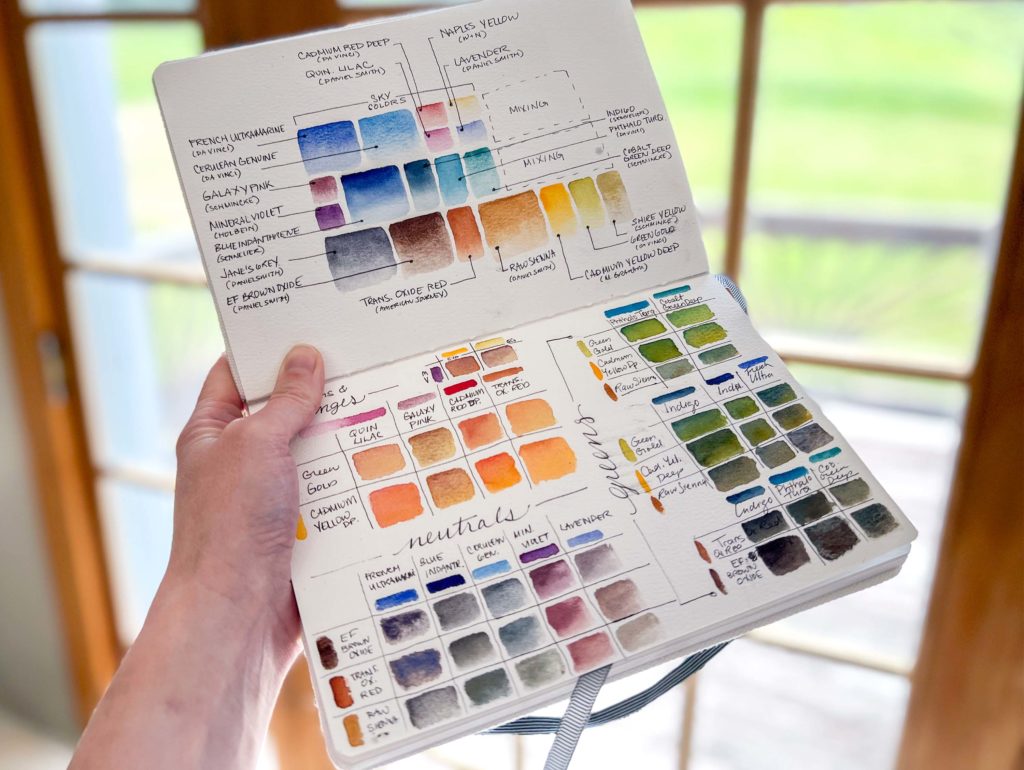
Before I even talk about the colors, I’ll cover the first question I usually get when sharing my palettes. Where did I get it?! Haha. I get it, I’m hugely dependent on using supplies I’m comfortable with and suit my painting style. I’m using a Folio Palette from Art Toolkit for this particular palette. They offer a few different sizes, but I like this one the best so far. The pans snap onto a magnetic base so you can move them around. Palettes come with a few options for pan sizes and layouts, but you can aways buy a packet of more pans and customize, which is my favorite part! (This isn’t a sponsored post or affiliate links, I just really enjoy them!)
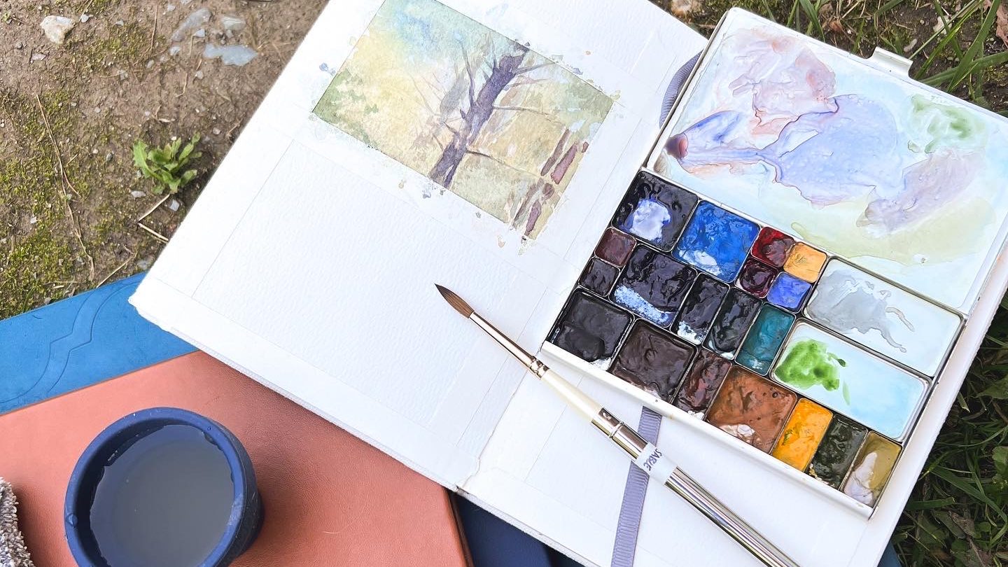
You may notice the general layout of the palette looks somewhat intentional. It is! The top row are colors that I would consider great sky colors. The second row, mostly blues and a few extra violets. The third row is earth tones and yellows with some Jane’s Grey in there.
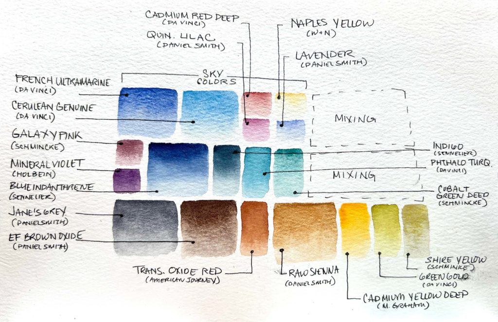
Excepting a few particularly strong colors like Phthalo Turquoise and Quinacridone Lilac (which are great mixers or best as small accents), most of the colors in the palette are quite beautiful and natural looking all on their own. What I mean is I can apply most of these colors straight from the pan and they wouldn’t look like a fluorescent marker ran loose in my painting. Many of them are granulating, but not all, and naturally a lot of the focus is on paints that make common colors in nature like greens, earth tones, and all sorts of blues. For sure there’s some brighter reds and purples, but these are more for either floral/botanical accents, adding contrast in shadows, or a morning/evening sky.
Okay, let’s pop down to mixing.
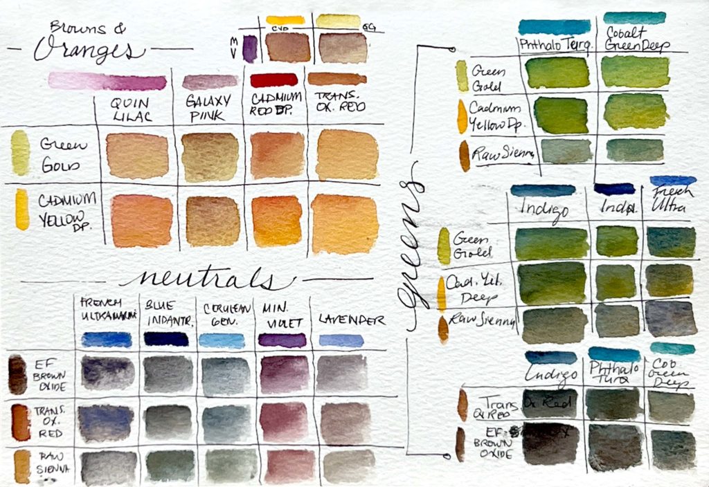
Obviously the focus is on greens here. There’s also some grays and browns and oranges for good scientific measure, but where I live I like to be able to create a range of greens to provide interest in tree and grass dominated compositions. You’ll in fact notice there’s not a single “Green” paint in my palette. That’s an intentional choice to not fall into the convenience rut and end up with a whole painting that mysteriously looks like a single color.
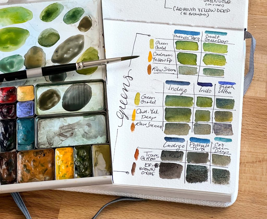
I defer to my cleaner yellows and greens for bright “spring green” foliage. Green gold (which is actually a yellow pigment) mixed with phthalo turquoise is my strongest contender here. If i want a little more zing, I can mix GG with cobalt green turquoise* (*not cobalt green deep as written in the chart). Cobalt will also add granulation, so a great choice if the foliage I’m painting is farther away and the granulation will effortlessly mimic clumps of leaves.
For mid-greens, I like toning down the brightness with cadmium yellow deep mixed with indigo or blue indanthrene. These warmer blues and the warmer yellow create a duller, more aged green that is perfect for late summer or shaded greenery.
Using raw sienna as your yellow gives you interesting options as well. Mixed with the super bright phthalo turquoise, you get a separating mixed color similar to Daniel Smith’s Cascade Green (which is phthalo blue and raw sienna). If you mix it with warmer blue, you’ll get a range of super earthy greens and grays, perfect for moss or stone.
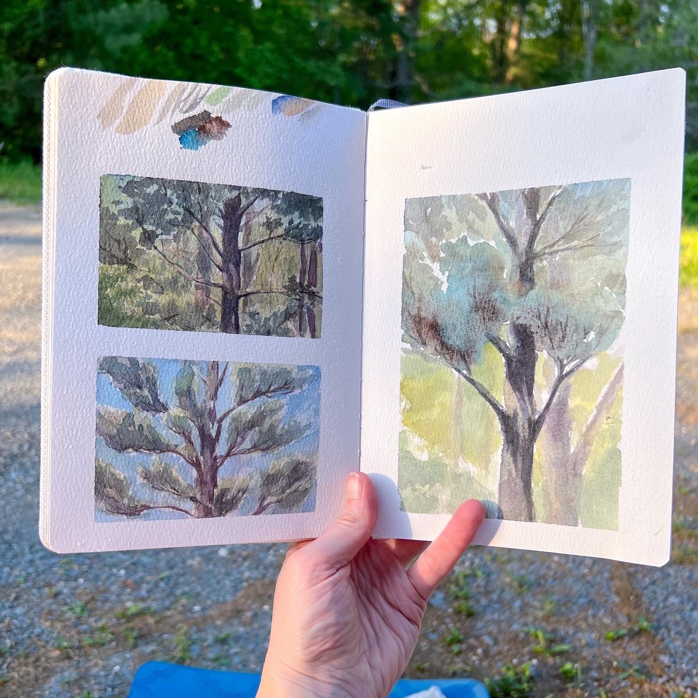
In the bottom chart are my common green shadow mixes. Phthalo turquoise mixed with either transparent oxide red or brown iron oxide provide a wonderful shadow color for pines and conifers. I paired this shadow color with a mix of cobalt green turquoise and a little raw sienna for a sun-lit white pine.
Still stumped on getting natural, interesting, or variations of green?
I’ll be doing two different workshops this year to address this specific color range! The first is in-person via IS 183 this July. I’ll be hosting a 2-day workshop at Chesterwood in Stockbridge called “Grow Your Own Greens: Learn to Create Greenery in Watercolor”. Conducted on two different Sunday mornings, we’ll paint outside and I’ll cover how to create green mixes that allow you to capture the world around you with depth and interest.
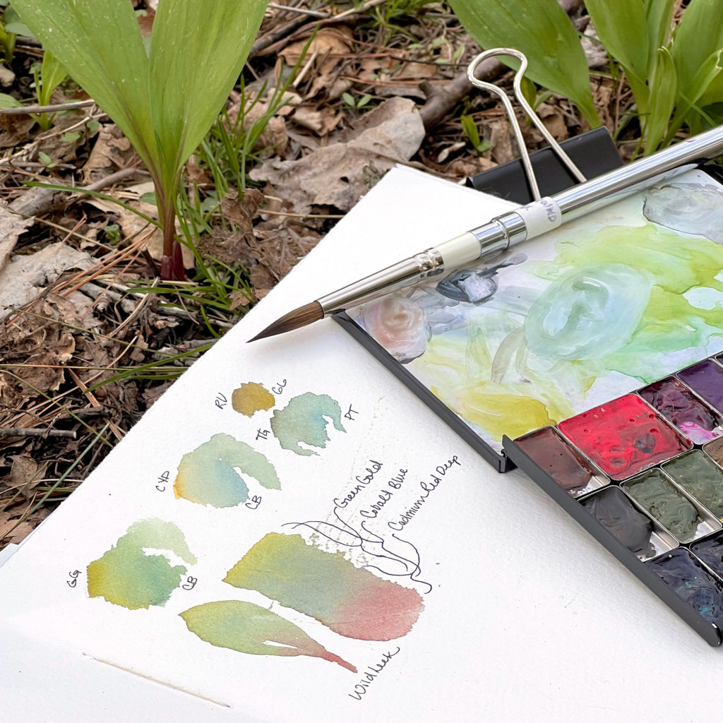
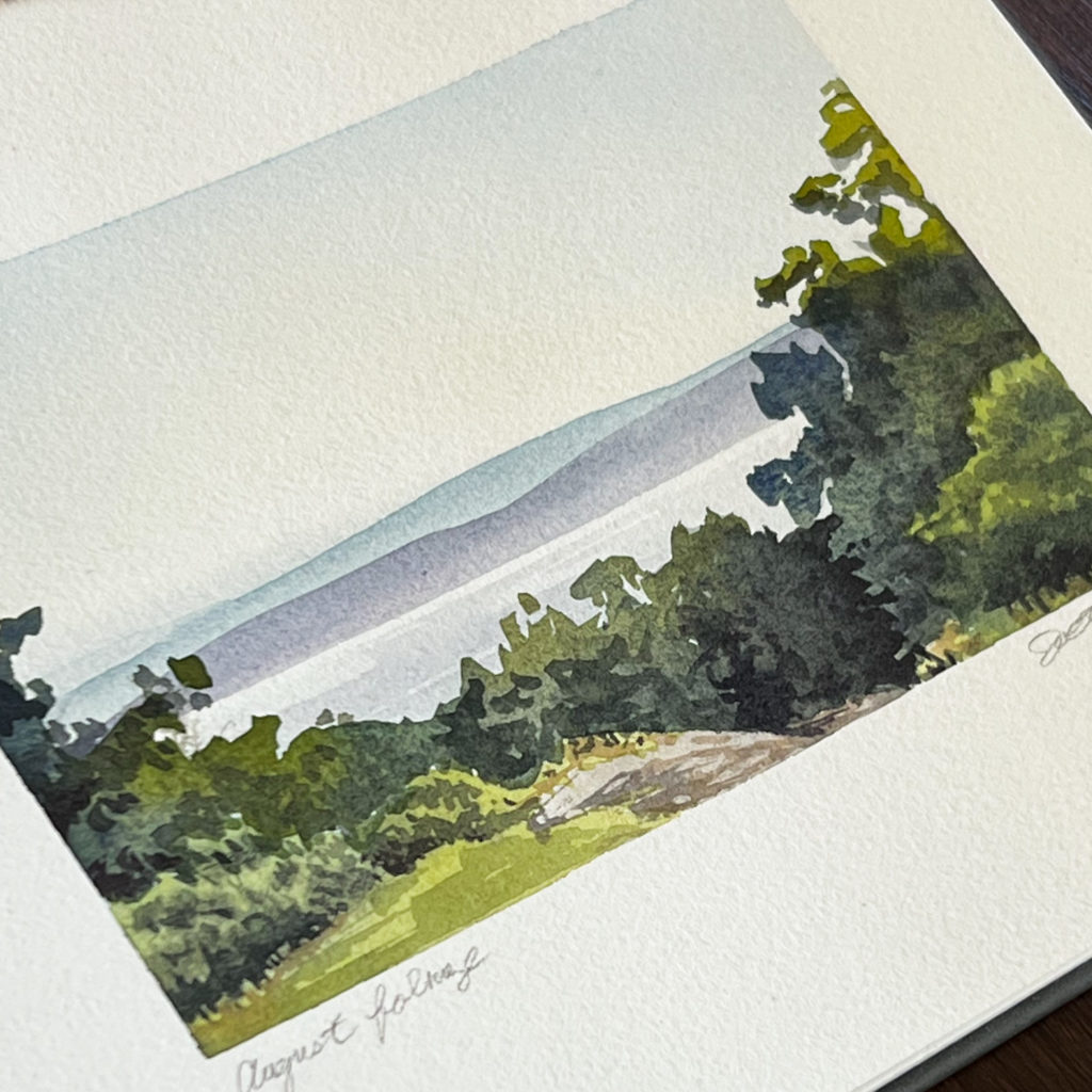
I’ll also be doing a similar online version of the topic later in the year so watch out for that!
Other Mixes
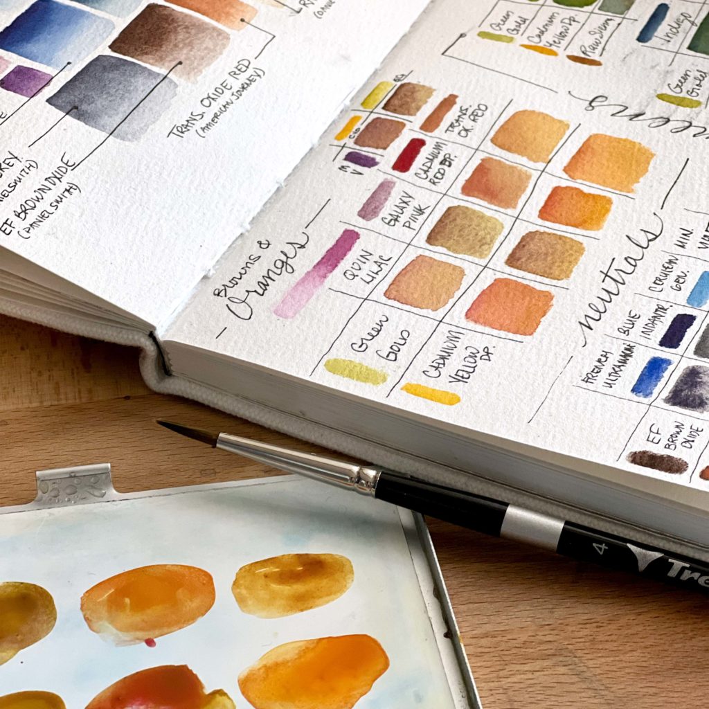
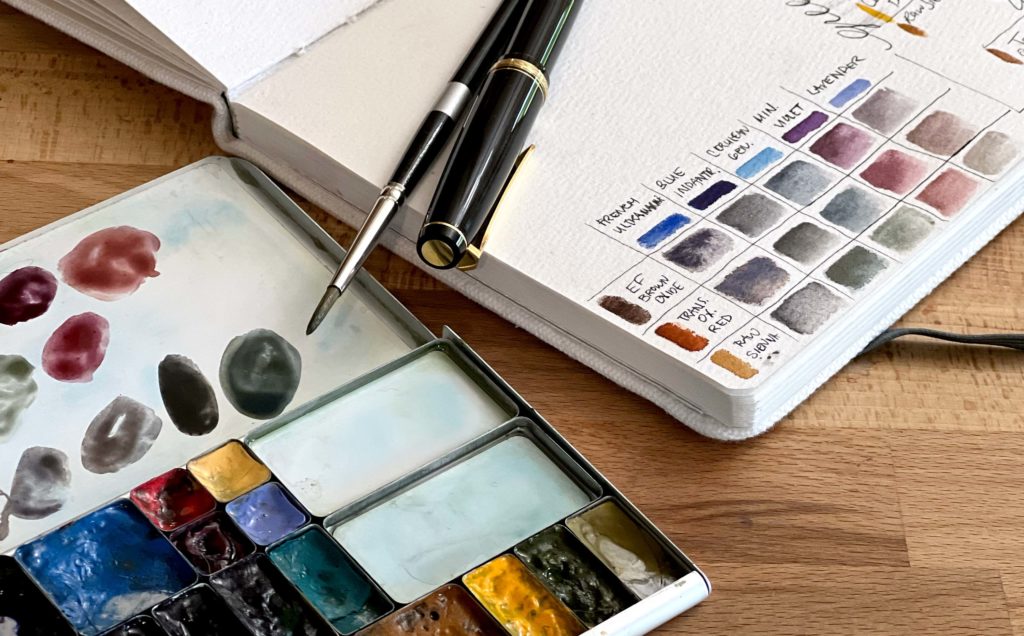
I also included mixing charts for common grays, violets, oranges and browns. Grays are common in my landscape paintings and it’s important to know how to get the right shade, i.e. warm gray, cool gray, granulating, etc. These 2-color gray mixes are all granulating as all of my warm tones are earth colors that are each granulating. If I wanted a smooth gray I would mix 3 non-granulating primaries like quinacridone lilac, green gold, and blue indanthrene.
Oranges are too prevalent but are used especially in the fall when the foliage changes. Knowing how to get different shades of orange and brown is equally important then as using a range of greens in the summer.
That wraps up my tour of my landscape palette! Remember I chose colors based on where I live and the plants and views around me. I always leave room in my opinion for things to change and I even expect them to shift as I gain experience. Don’t feel like this is a you-must-have-these-exact-colors sort of post. On the contrary, I hope you feel like you can take on painting the great outdoors now with some insight into choosing and mixing your colors!
Until next time! Thanks for reading!
~Jill